R 패키지/ggplot2
[R 통계_ggplot2 패키지] 00. ggplot 패키지의 문법 구성
캐
2021. 9. 18. 21:38
728x90
R 데이터 시각화에서 가장 많이 사용되는 ggplot에 대해 학습하고, 그 내용을 누적하고자 한다.
ggplot2 패키지는 증분방식으로 제작되어, 기본적인 그래픽을 생성 후
드를 추가하는 방식으로 상세한 분석이 가능하다.
<ggplot2의 기본 문법 구성>
| 데이터 (Data) | 그래프로 표현하고자 하는 데이터 |
| 미적 요소 매핑 (Aesthetic Mappings) |
- 그래프의 미적 표현을 담당하는 요소 - position (x축, y축 등) - color (바깥쪽(?) 색상) - fill (안쪽(?) 색상) - Shape (점의 모양 등) - line type (선의 모양 등) - size (점의 크기 등) |
| 기하학적 객체 (Geometric Object) |
- 데이터를 어떤 형태로 표현할 것인가를 담당하는 요소 - geom_point(): 점 그래프 - geom_bar: 막대 그래프 - geom_line(): 선 그래프 - geom_boxplot: 박스플롯 그래프 등 다양하다 ★ R 코드에 apropos("^geom*_")를 입력하면, geom_ 로 시작되는 53개의 객체를 확인할 수 있다. |
| 분할면 (Faceting) |
- 데이터의 subset별로 조건부 플롯을 만들도록 해주는 요소 |
| 통계적 변환 (Statistical Transformation) |
- 통계적 변환 (평활화, 사분위수 등)을 지원하는 요소 |
참고자료: https://beanumber.github.io/sds192/lab-ggplot2.html
Graphics with ggplot2
Points Now that we know about geometric objects and aesthetic mapping, we’re ready to make our first ggplot: a scatterplot. We’ll use geom_point to do this, which requires aes mappings for x and y; all others are optional. hp2013Q1 <- housing %>% filte
beanumber.github.io
install.packages("ggplot2")
library(ggplot2)
#R에서 내장된 mtcars 데이터를 사용해보자
head(mtcars)
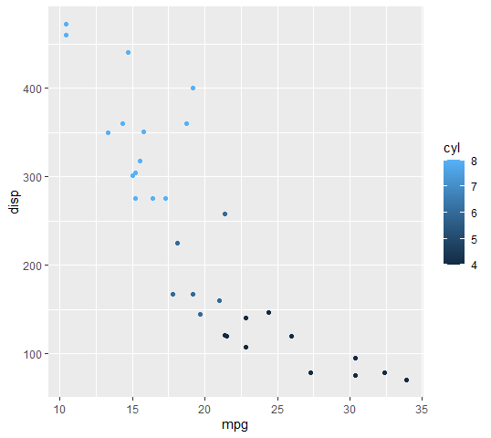
plot_graph_layer <- ggplot(mtcars, aes(mpg, disp, colour=cyl))
plot_graph <- plot_graph_layer + geom_point() # 점 그래프 형태로 나타내보자
plot_graph #print(point)를 줄여서 표현한 것<산출 결과>
위에 산출한 plot_graph 결과를 가지고, 상세하게 알아보자
#names 함수를 통해 상세 내용을 확인해보자
names(plot_graph)

<결과 1>
[1] "data"        "layers"      "scales"      "mapping"     "theme"
[6] "coordinates" "facet"       "plot_env"    "labels"


# 각 요소가 어떻게 구성되어있는지 알아보자
plot_graph$data

<결과(data)>
                     mpg cyl  disp  hp drat    wt  qsec vs am gear carb
Mazda RX4           21.0   6 160.0 110 3.90 2.620 16.46  0  1    4    4
Mazda RX4 Wag       21.0   6 160.0 110 3.90 2.875 17.02  0  1    4    4


plot_graph$layers

<결과(layers)>
[[1]]
geom_point: na.rm = FALSE
stat_identity: na.rm = FALSE
position_identity


plot_graph$scales

<결과(scales)>
<ggproto object: Class ScalesList, gg>
    add: function
    clone: function
    find: function
    get_scales: function
    has_scale: function
    input: function
    n: function
    non_position_scales: function
    scales: list
    super:  <ggproto object: Class ScalesList, gg>


plot_graph$mapping

<결과(mapping)>
Aesthetic mapping:
> `x`      -> `mpg`
> `y`      -> `disp`
> `colour` -> `cyl`


plot_graph$theme

<결과(theme)>
list()


plot_graph$coordinates

<결과(coordinates)>
<ggproto object: Class CoordCartesian, Coord, gg>
    aspect: function
    backtransform_range: function
    clip: on
    default: TRUE
    distance: function
    expand: TRUE
    is_free: function
    is_linear: function
    labels: function
    limits: list
    modify_scales: function
    range: function
    render_axis_h: function
    render_axis_v: function
    render_bg: function
    render_fg: function
    setup_data: function
    setup_layout: function
    setup_panel_guides: function
    setup_panel_params: function
    setup_params: function
    train_panel_guides: function
    transform: function
    super:  <ggproto object: Class CoordCartesian, Coord, gg>


plot_graph$facet

<결과(facet)>
<ggproto object: Class FacetNull, Facet, gg>
    compute_layout: function
    draw_back: function
    draw_front: function
    draw_labels: function
    draw_panels: function
    finish_data: function
    init_scales: function
    map_data: function
    params: list
    setup_data: function
    setup_params: function
    shrink: TRUE
    train_scales: function
    vars: function
    super:  <ggproto object: Class FacetNull, Facet, gg>


plot_graph$plot_env

<결과(plot_env)>
<environment: R_GlobalEnv>


plot_graph$labels

<결과(labels)>
$x
[1] "mpg"

$y
[1] "disp"

$colour
[1] "cyl"
728x90